Role
User Experience Designer
Responsibilities
User Experience
Interface Design
Usability Testing
Gain Customer insight into usability of the proposed updated map solution and its components.
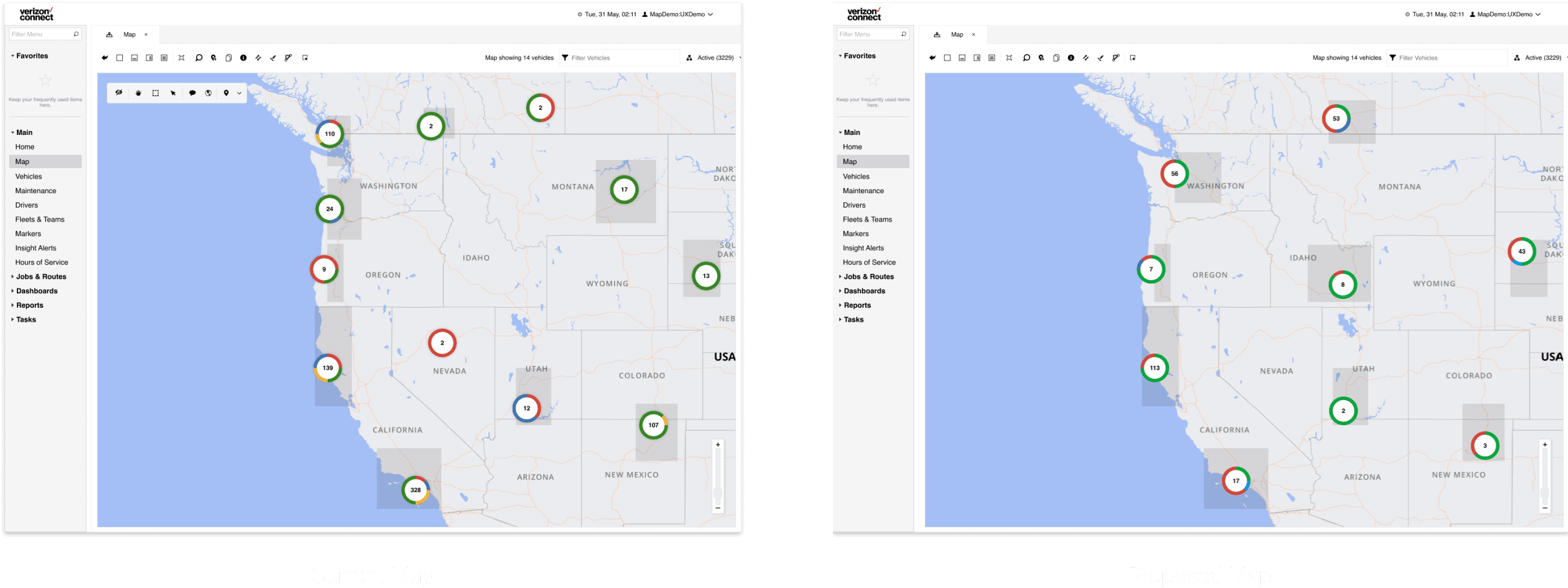
Layers with large numbers of features are often difficult to visualize well. These high-density layers typically have features that are close together or overlapping, which makes it difficult or impossible to distinguish between them or see spatial patterns. Although advancing technology allows the display of increasing numbers of features, being able to draw all features does not necessarily mean that you should. The opposite is often true: additional features can result in a more confusing map. Effectively visualizing high-density data is different from displaying all features.
Proposed updates
We’ve updated both the colour contrast of the map and its components to make them more visible on both static and satellite maps. We also introduced a new vehicle overlay, designed to accommodate EV UI elements in the future.
Additionally, there have been subtle hex colour changes to brighten up the overlaying elements on the new map.
Using Pendo, we created a walkthrough that gave selected users two weeks to explore the proposed changes and provide feedback. While the feedback was qualitative, it offered valuable insights and highlighted other areas to consider for future improvements.
At the end of the walkthrough, we included a survey screen with questions about their initial thoughts on the proposed design, any other changes they'd like to see, and an option to be contacted for further questions about their feedback.
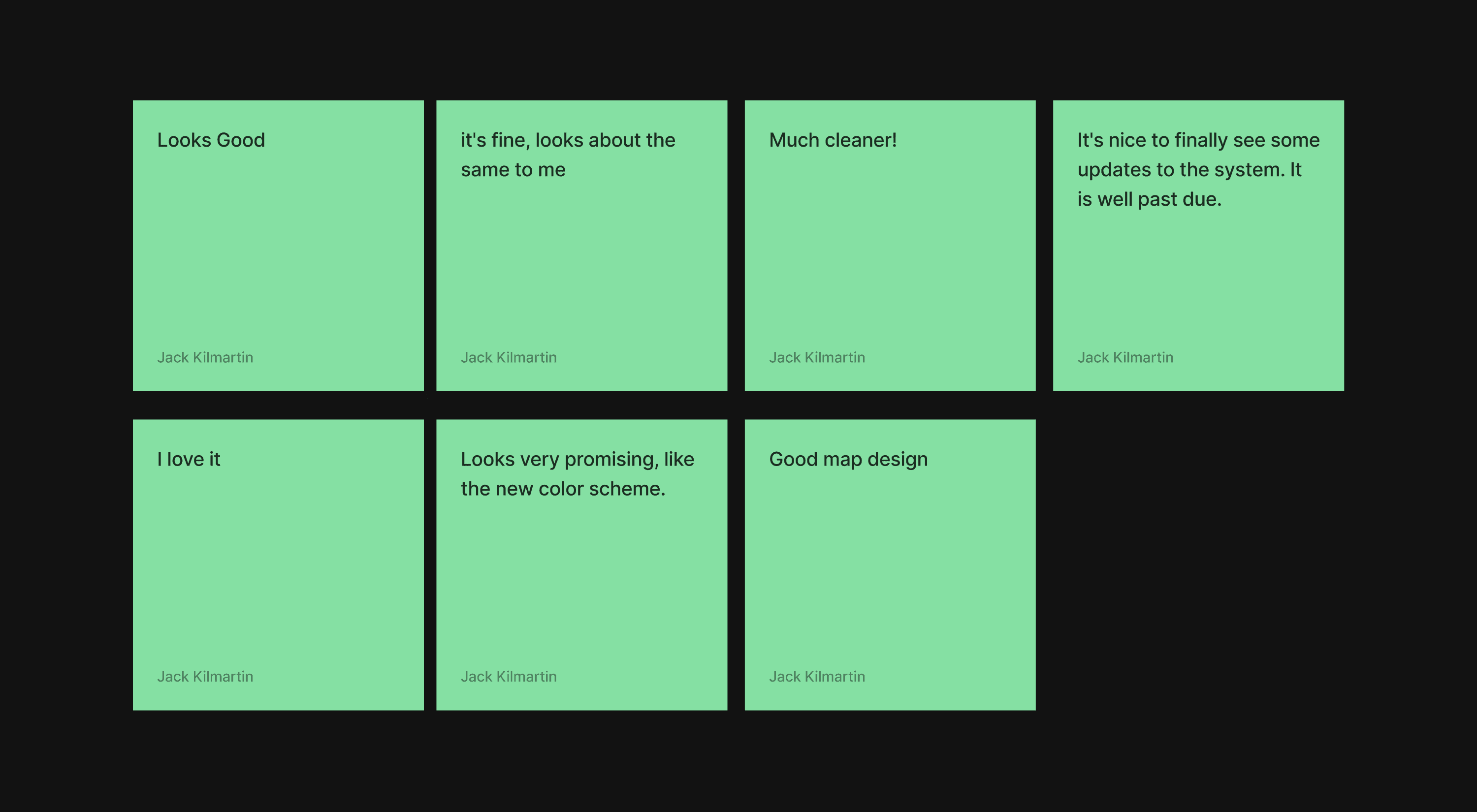
Overall, the proposed map update was well received, and the feedback provided valuable insight into whether the changes would enhance the product.
Intial feedback on the proposed design:
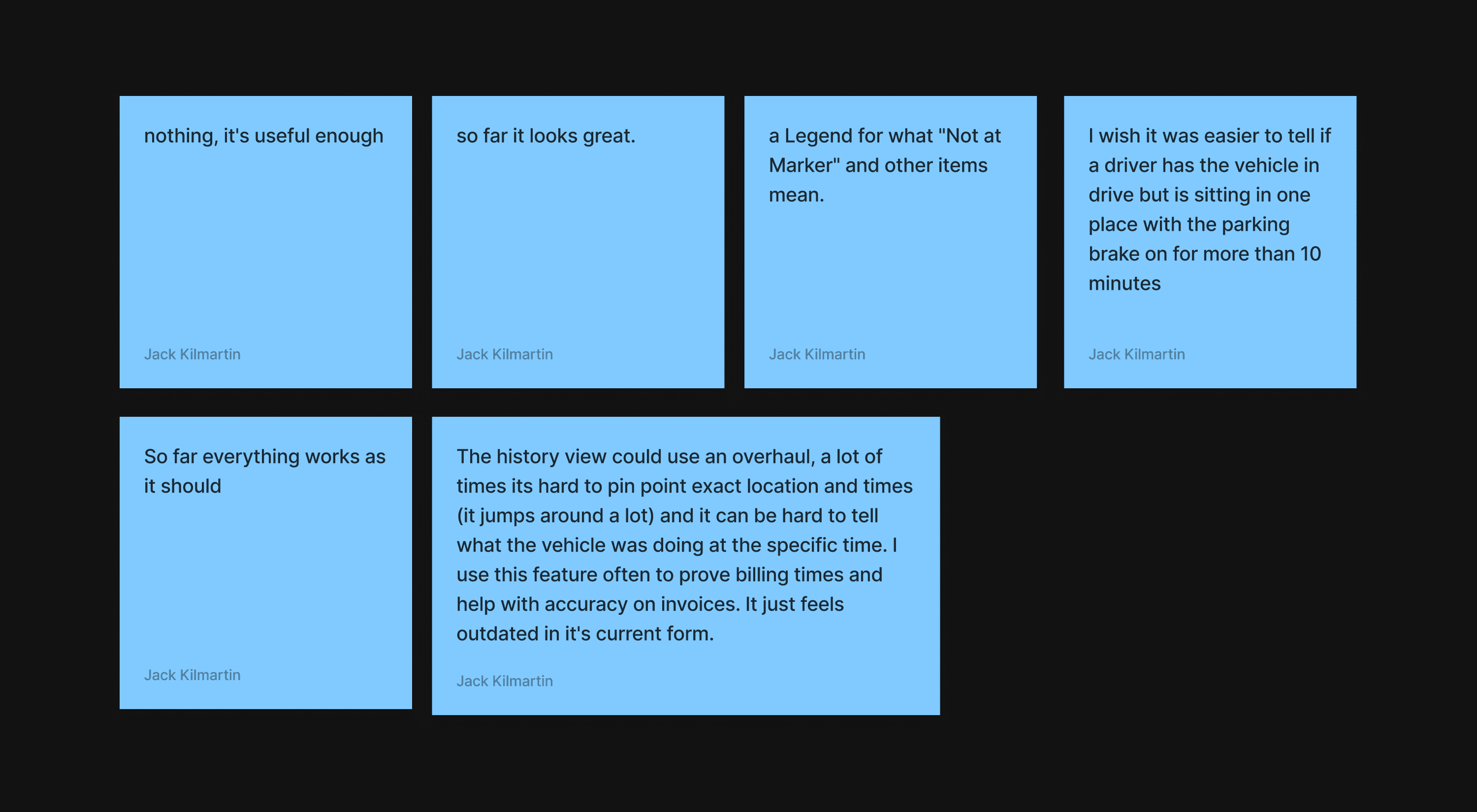
Any other changes you'd want to see?:


