Role
Lead Experience Designer
Responsibilities
User Experience
Interface Design
Usability Testing
Design System
We have internal personas for different user types within the business, in this case our most applicable user is 'John' a driver who will be using Logbook daily to stay compliant to the driving laws in their state and carrying out any reporting needed such as inspections and confirming driving logs if they need to be assigned.
Looking into John, hes constantly on the road, might not enjoy using technology over good old fashioned paper logs however complys for his and the companies best interest. Currently gets notified with a lot of alerts and reminders so critical information such as driver logs can get lost in the pile of notifications.
I went through a competitor research and analysis phase intially to see what other companies do for notification panels, there was a lot, from here I crafted up some designs to review with the Product owner, engineers and with my wider Design team in our weekly design reviews throughout the life of this project.
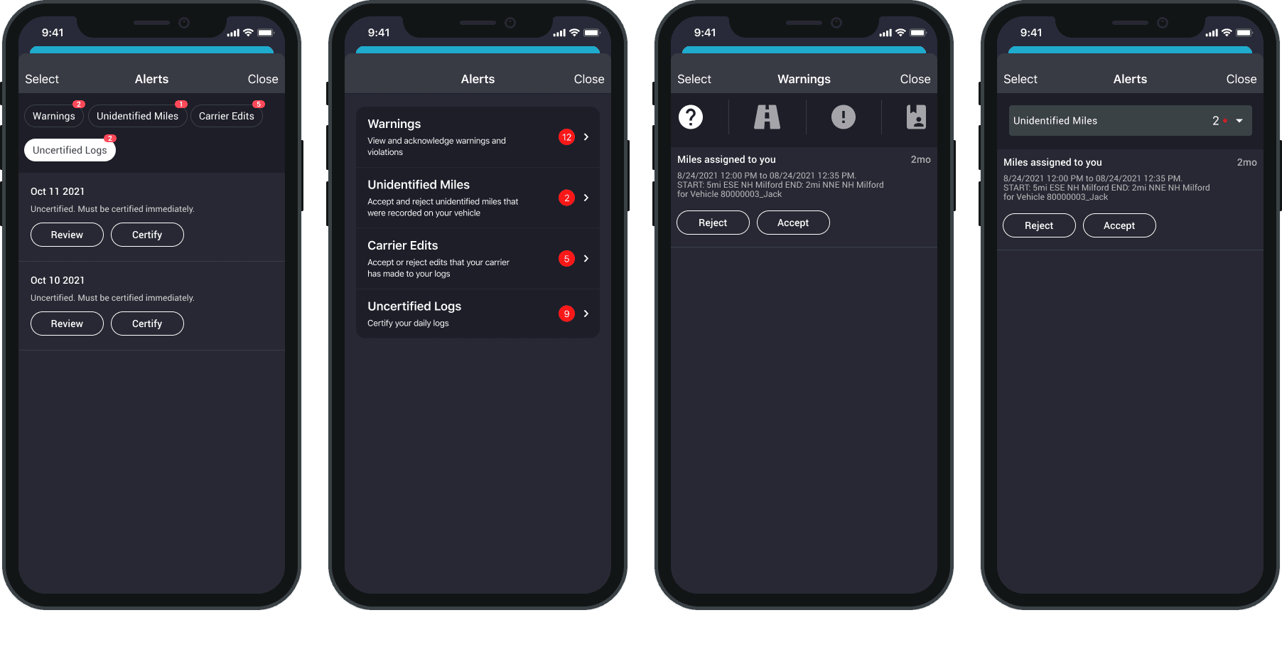
We explored a wide range of concepts and conducted guerrilla testing in the office to observe how people interacted with them. Our findings revealed issues with the visibility of certain elements—for example, concept 2, we discovered that a back button would be necessary once a user clicks into a tab. This design proved less intuitive.
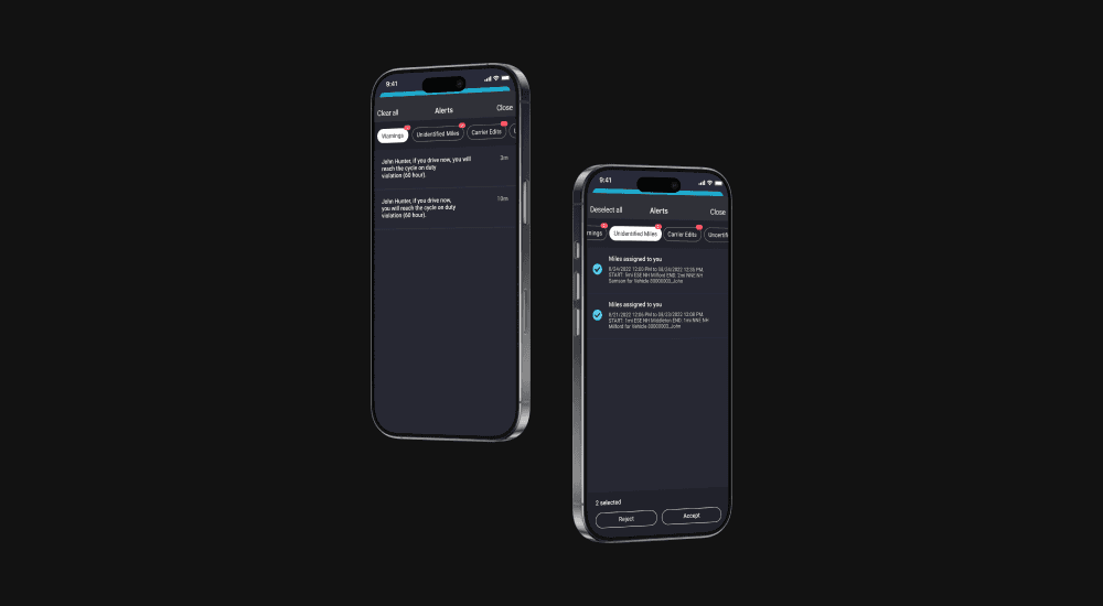
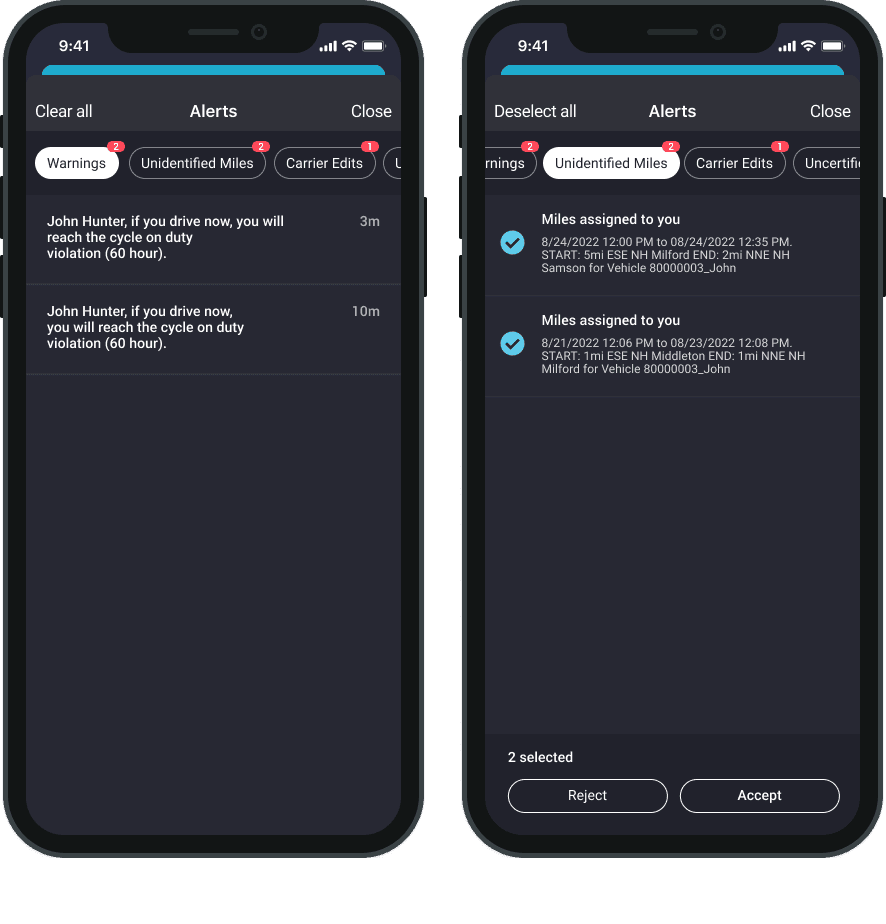
The concept that moved forward was the pill tab design. We settled on this approach, which is inspired by YouTube's subscription filtering buttons and provides visibility for all four tabs a user will encounter.
We also considered a secondary concept using icons. However, I had to question: Would users understand this? What's the learning curve for icons without labels, or how can we find icons that provide sufficient context even with labels? After extensive design reviews, in-office user testing, and team discussions, we ultimately returned to the pill tab design. We found that this approach best satisfies both user and business requirements.
We faced several constraints during this process, including limitations from our tech stack, design system, and design decisions. Firstly, our design system and tech stack restricted the components we could use. However, our developers excelled at finding workarounds to bridge the gap between design and implementation.
Design decisions were also a significant challenge. Unfortunately, we lacked the resources to plan comprehensive user testing, which led to some uncertainty. We managed this by understanding the concerns, working within our limitations (such as conducting user testing in-office), and steering the project in a positive direction.
+
19.1%
Increase in alert page visitors compared to month prior of release.
-
4.7%
Decrease in time spent on page compared to month prior of release.
We released this feature in late 2022 and have received positive feedback. Since then, we've observed higher visit rates, users are no longer ignoring notifications as frequently. We've also noted a decrease in time spent on the page, as users can find and action what they're looking for more quickly. Having all unidentified driving logs in one place for users to accept has significantly improved compliance turnaround times. This has reduced the need for dispatchers to constantly follow up, streamlining the entire process.


